

User-centered design isn't a phase before development, it's a constraint on it. Here's where mobile teams skip it and what it costs them.
Codestreaks Team
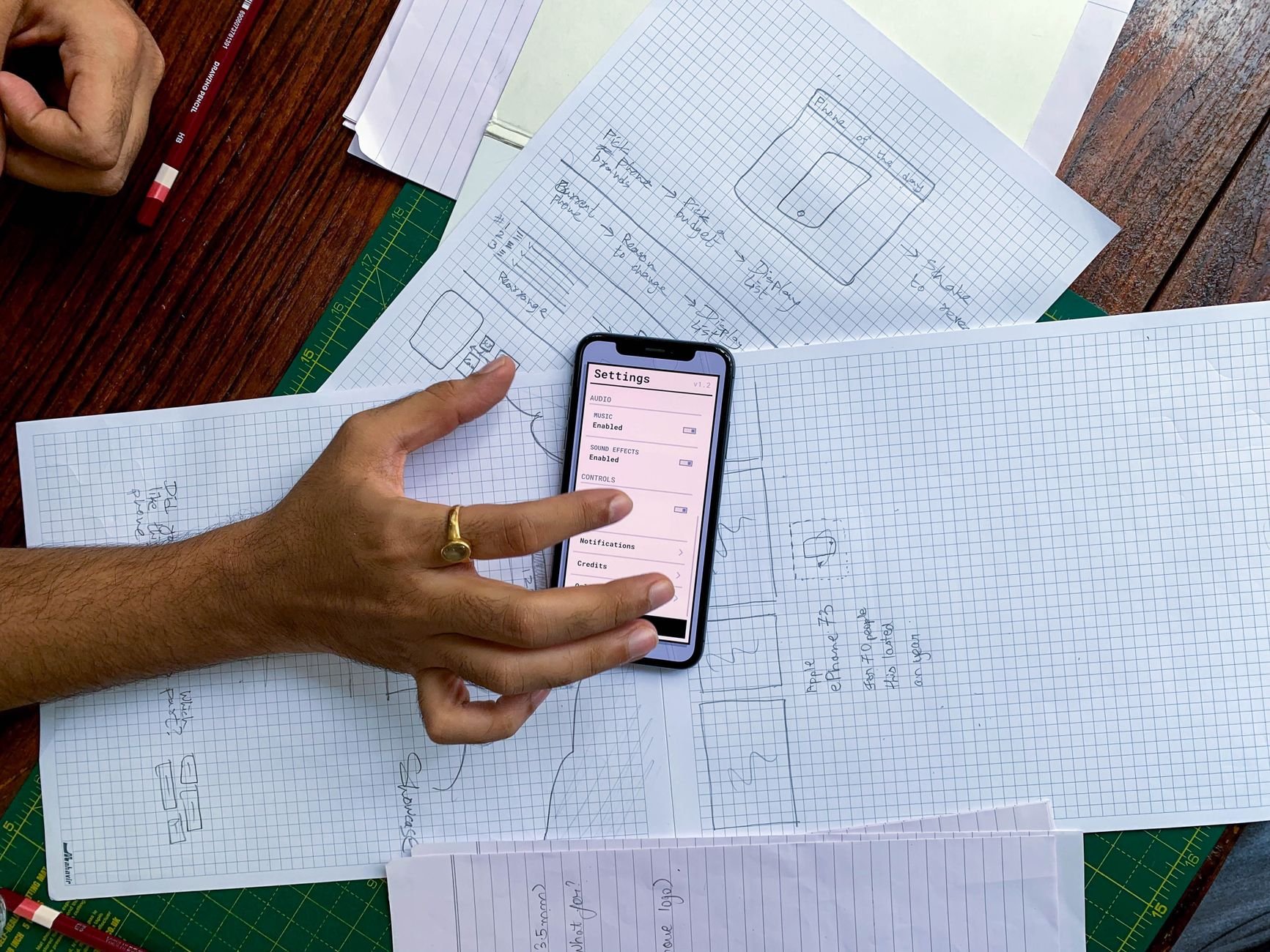
User-centered design means the app's structure gets shaped by how people actually use it, not by how the org chart or the database schema is structured. In practice, most teams say they do this and then skip it the moment a deadline gets tight, because it's the step that's easiest to compress without anything visibly breaking, until three months post-launch when support tickets pile up around the same three screens.
We've built mobile apps across enough industries (healthcare, restaurants, logistics) to see the same failure pattern repeat: the app works in the demo, because the demo follows the happy path the team designed for. Real users don't follow the happy path. They fat-finger a field, lose signal mid-checkout, get interrupted and come back to a stale session. A user-centered process designs for those cases up front; a feature-first process discovers them in production.
It's not a design philosophy that stays in Figma. Three concrete things change when a team takes it seriously:
Navigation gets tested against real tasks, not org structure. A common mistake is building navigation around how the business thinks about its product (Products, Analytics, Settings) instead of what the user is trying to accomplish (Am I on track this week? Did that transaction go through?). The fix usually means one more round of structuring the IA around tasks, not features, before a single screen gets built.
Error states get designed, not defaulted. A generic "Something went wrong" toast is what happens when error states weren't part of the design pass. A user-centered process asks, for every input, what happens when this fails, and designs that state specifically: what the user sees, what they can do next, whether they lose their work.
Onboarding gets tested with people who've never seen the app. Internal team members can't evaluate onboarding, they already know what everything does. This is the single most skipped step we see, because it requires finding and scheduling actual outside testers, which is slower than shipping and hoping.
The pattern we see most in 2025-era builds: teams compress the design phase to hit a launch date, ship a functional-but-generic app, then spend the next two quarters doing what should have been week-two UX work as "post-launch improvements." It's not that the redesign work disappears, it just moves later, gets more expensive because now it's changing shipped code and retraining existing users, and gets attributed to "iteration" instead of "we skipped a step."
The honest tradeoff: user-centered design work adds roughly one to two weeks to a typical build timeline. It's cheaper than the alternative, which is discovering the same problems from support tickets and a declining retention curve.
From the field: on a restaurant ordering app we built, the initial flow put "add to cart" behind two taps because that matched how the client described their menu structure internally (category, then item, then modifiers). User testing with five actual diners showed three of them abandoning before checkout. We flattened it to one tap for common items. Order completion went up, and it cost us two days, not two months, because we caught it in a prototype instead of in the App Store review section.
There's a lot of discussion about the best mobile app development framework, Flutter, React Native, Swift/Kotlin native, and it does matter for performance and platform-specific features later. But framework choice rarely determines whether an app feels good to use in the first three months. A React Native app with a genuinely user-centered flow will beat a native Swift app with a confusing IA every time. Pick the framework based on your team's skills, your performance needs, and your maintenance plan; don't expect it to fix a design problem.
IoT mobile app development and manufacturing mobile app development add a layer user-centered design has to account for: the user isn't always looking at the screen. A warehouse worker checking a device status app has gloves on, is walking, and glances at the phone for two seconds. That changes what "user-centered" means: bigger touch targets, status visible without scrolling, critical alerts that don't require reading a paragraph. Consumer app UX patterns (subtle animations, dense information screens) actively hurt usability in these contexts. Designing for a factory floor user and designing for a consumer app user are different jobs even when the underlying tech stack is identical.
A few honest questions surface the gap fast. Has anyone outside the founding team or dev team used a working prototype before launch, or did the first outside users see it the day it shipped? Does the app have designed states for zero-data, slow-connection, and error scenarios, or does every failure fall back to the same generic message? Was the navigation structured around a list of features, or around the two or three things a user actually opens the app to do?
If the honest answer to most of those is "we didn't get to that," the app was feature-first, not user-centered, regardless of how much the team believes otherwise. That's not a moral failing, it's usually a scheduling one: user testing feels optional under deadline pressure in a way that finishing a feature doesn't, even though skipping it just moves the cost to after launch, where it's more expensive to fix.
Typically one to two weeks for a small-to-mid-size app: task-based IA, prototype, a round of testing with 5-8 outside users, then revisions before development starts on the affected screens.
Yes, but it's more expensive than doing it up front, because you're now changing shipped screens, migrating existing users through a new flow, and possibly rebuilding components that were built around the old IA.
Usually fewer. Task-based flows tend to collapse multi-step processes that were split up to match backend structure, not user need.
No. Internal tools and B2B apps benefit more, arguably, because internal users don't have the option to switch to a competitor when the UX is bad. They're stuck with it, which just moves the cost to lost productivity instead of lost customers.
Five people outside your team, unscripted, given one real task to complete without guidance. You'll see the same two or three problems repeat across all five, which is your priority fix list.
If you're scoping a mobile build and want a second opinion on whether the proposed flow is task-based or org-chart-based, that's a free 30-minute conversation, and we respond within two business days. See our approach to mobile app development or start a project.


